Bulmo, Brand Identity, Naming, Art Direction
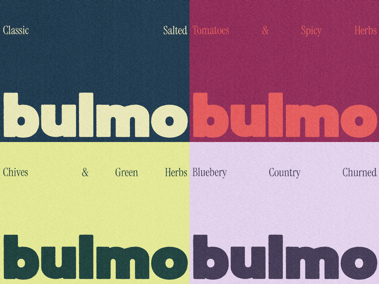
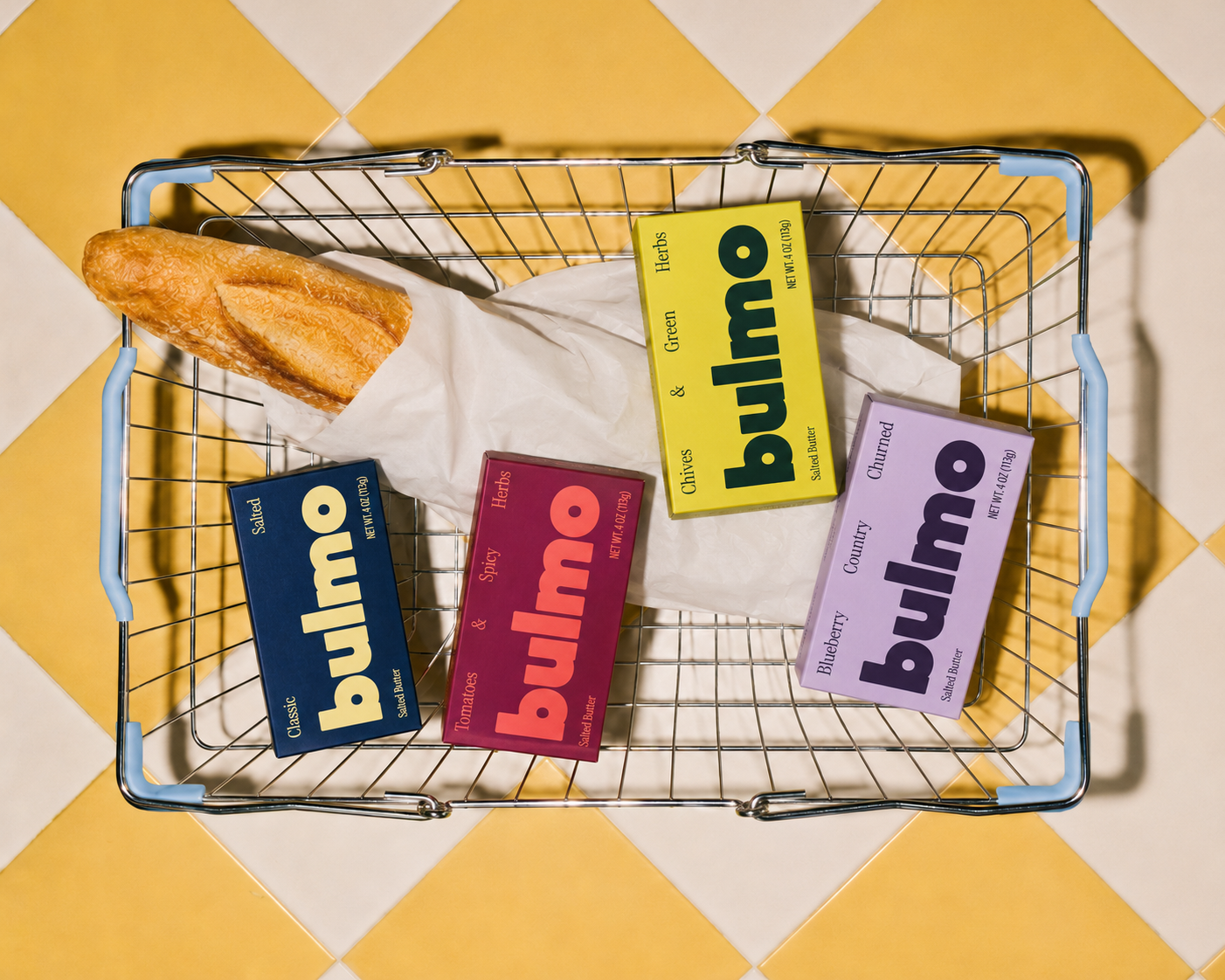
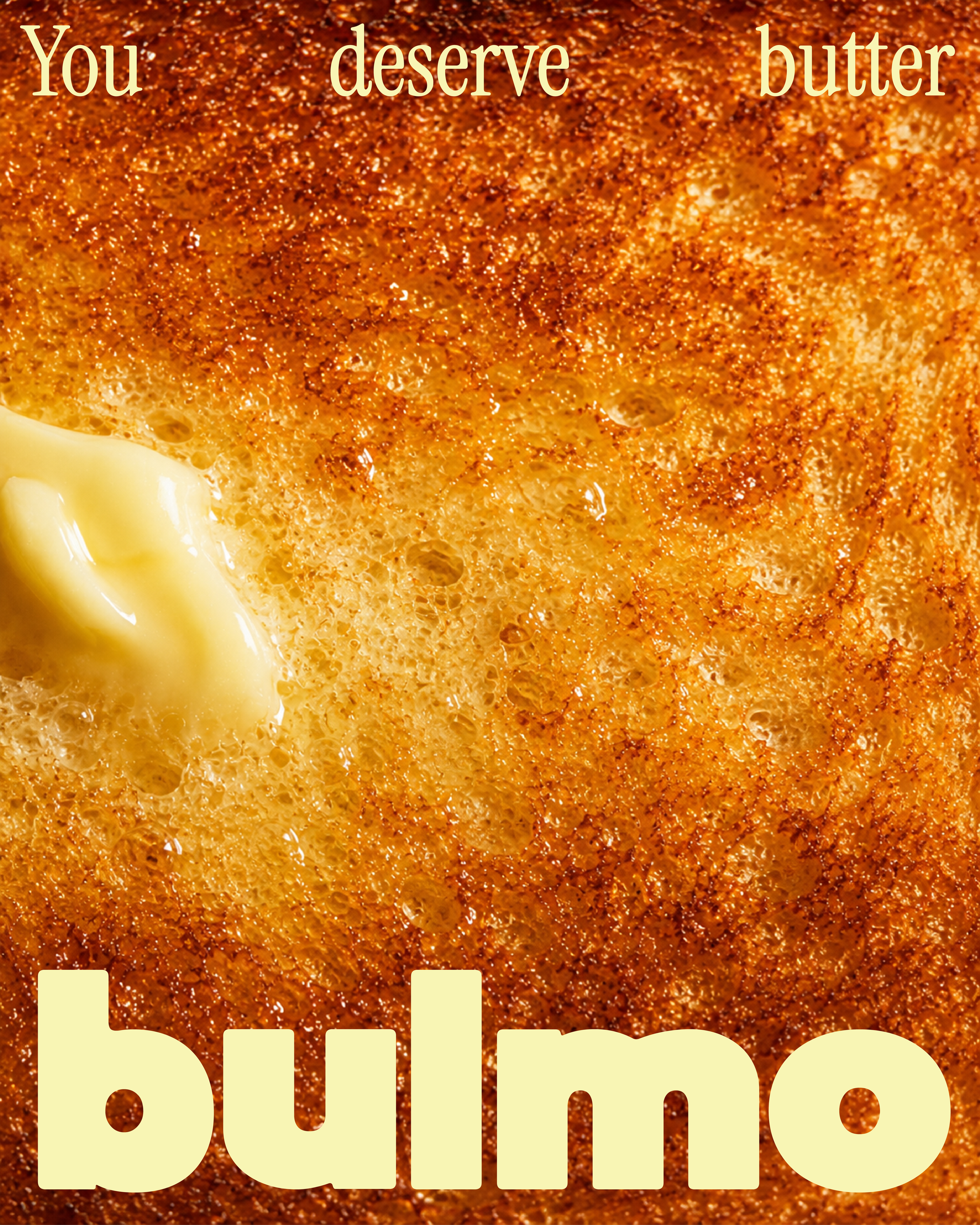
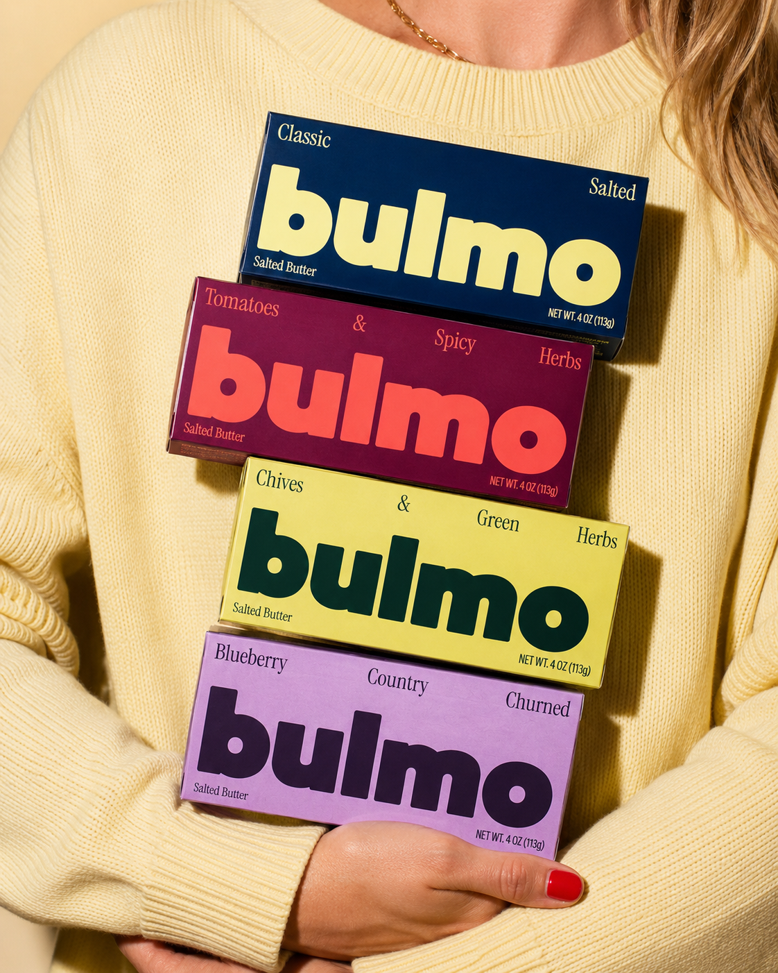
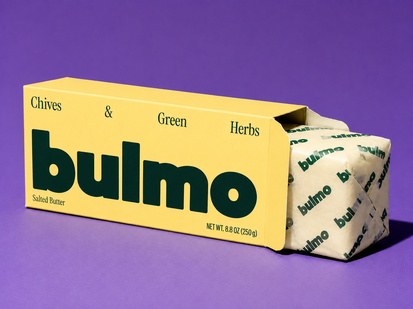
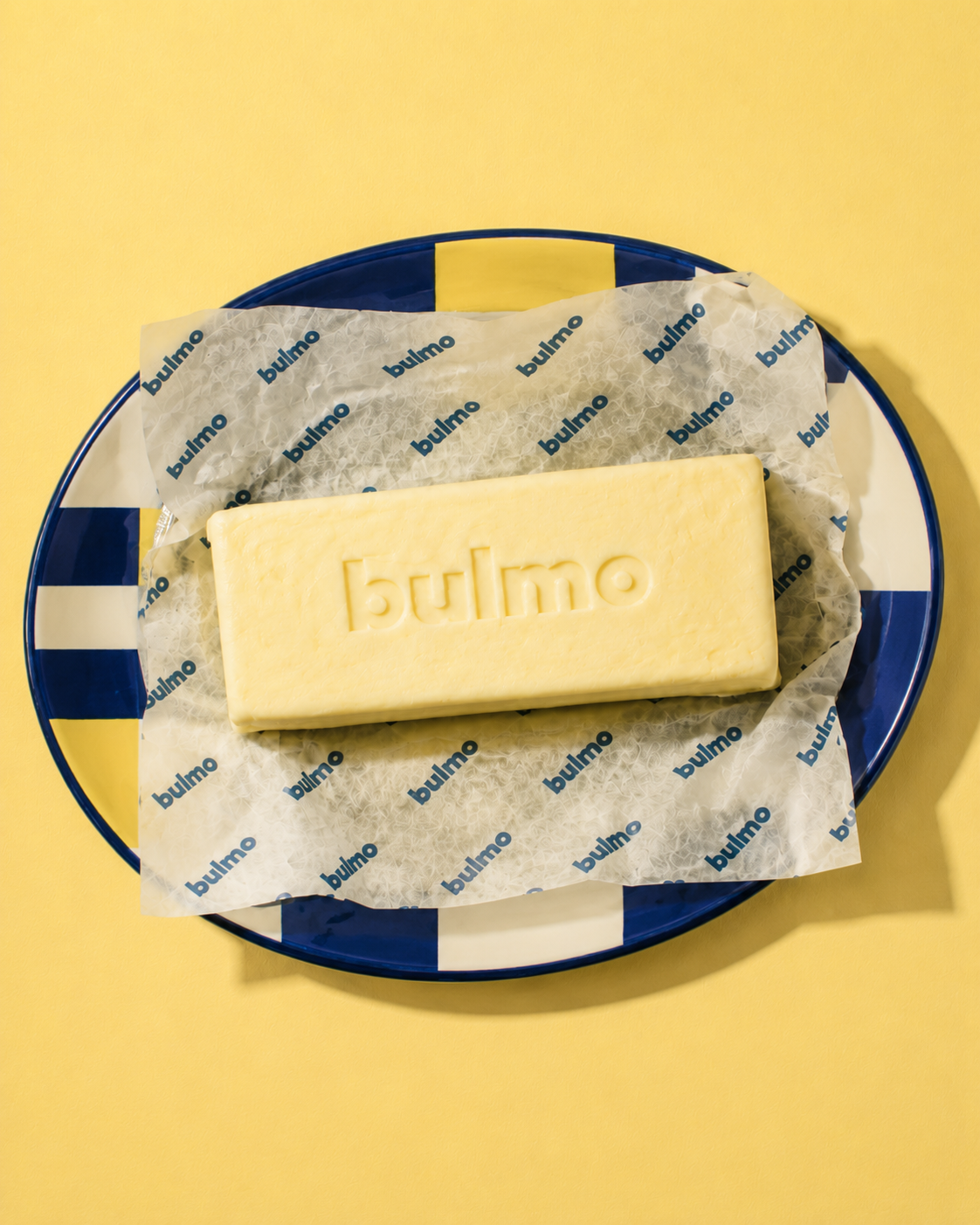
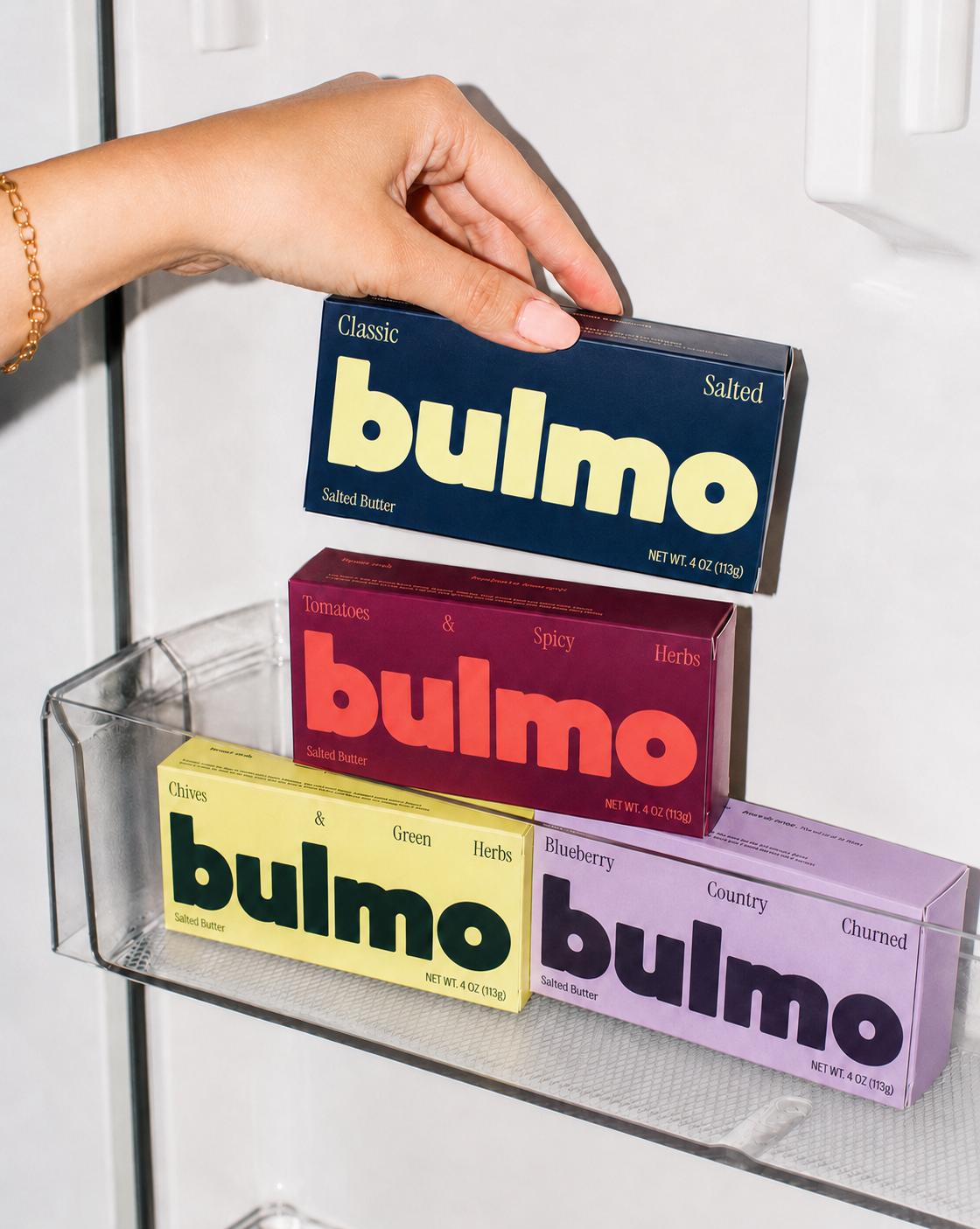
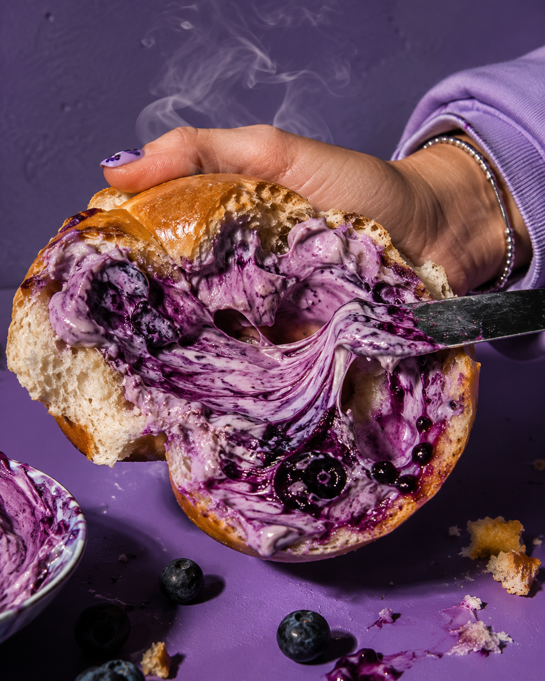
Butter branding tends to reach for the same handful of words: artisanal, elevated, curated. Bulmo needed to skip that script and sound like it was made by someone who actually cooks, not someone selling a lifestyle. That started with the name itself, short, blunt, confident, paired with an oversized, chunky wordmark built to read from across a shelf instead of blending into one. Four flavours got four distinct colourways instead of a safe, unified palette: navy for the classic, magenta for tomatoes and spicy herbs, chartreuse for chives and green herbs, lavender for blueberry country churned, so the range reads as personality rather than a line extension nobody can tell apart. That same attitude carried through the voice: pack copy, a monogram embossed straight into the butter itself, photography that leans into mid-melt toast shots over sterile product grids. The system was built to travel past the shelf too, farmers market wraps, recipe cards inside every carton, merch in the flavour colourways, treating the brand as something people want to carry around, not just buy once.
The result is a butter brand that sounds like a friend who cooks well and refuses to gatekeep the recipe, not another product performing indulgence.
Creative Services:
Art Direction
Logo Design
Packaging Design
Product Naming