Temoco Skincare Line Package Design
Temoco is a vibrant skincare packaging concept designed to feel fresh, playful, and uplifting. I set out to create a visual identity that breaks away from sterile, clinical packaging and instead celebrates color, clarity, and joy in daily rituals.
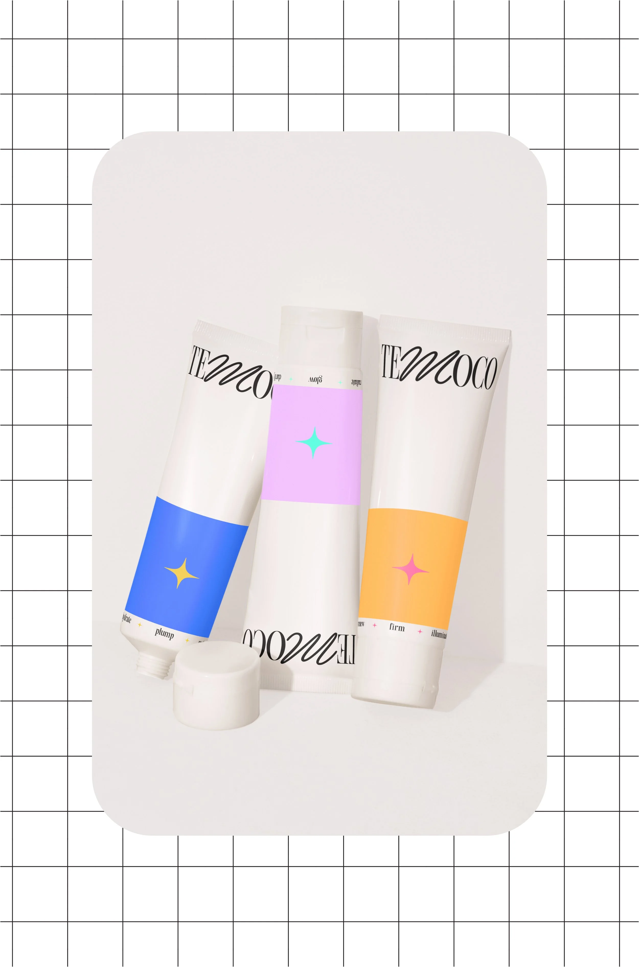
The design features:
A white, minimal base for a clean, modern look.
Vivid pastel blocks and soft gradients to define product types by mood and effect.
Playful serif and script typography that blends elegance with approachability.
Iconic starburst motifs and bold, emotional keywords like hydrate, glow, soothe, and radiate, helping customers instantly connect with the product's benefits.
Each variation stands alone in its expression, yet the full set creates a cohesive shelf presence that feels bright, energetic, and full of personality.
Role
Designer (Concept)
Year
2024