Bulmo Butter
Project Type
Brand Identity
Packaging Design
Retail Product
Services
Art Direction
Naming
Brand Identity
Packaging Design
Project Overview
A butter brand that sounds like it was made by someone who actually cooks.
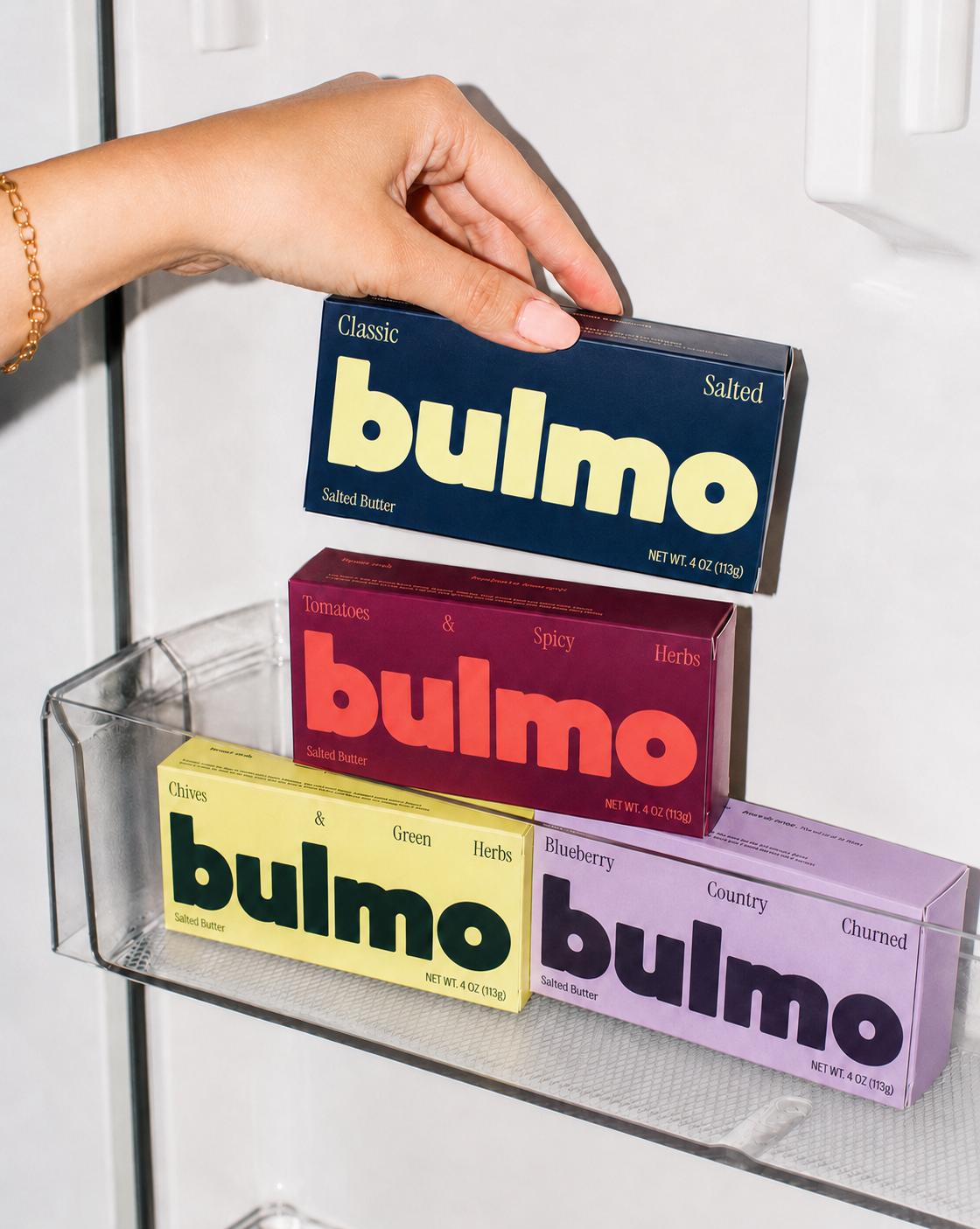
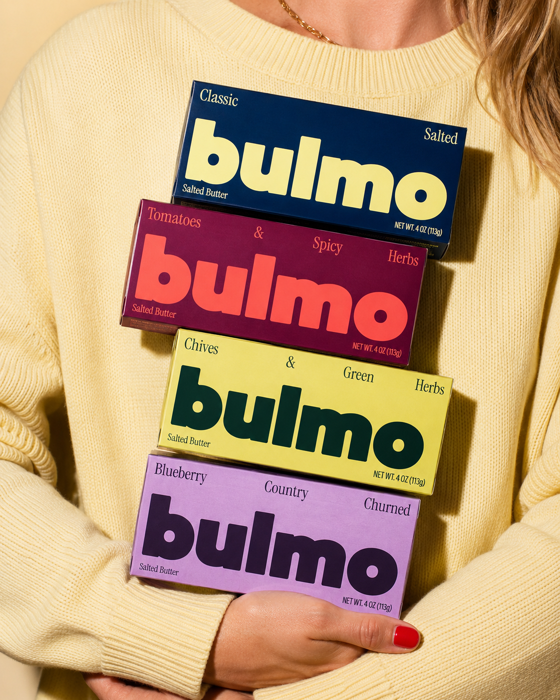
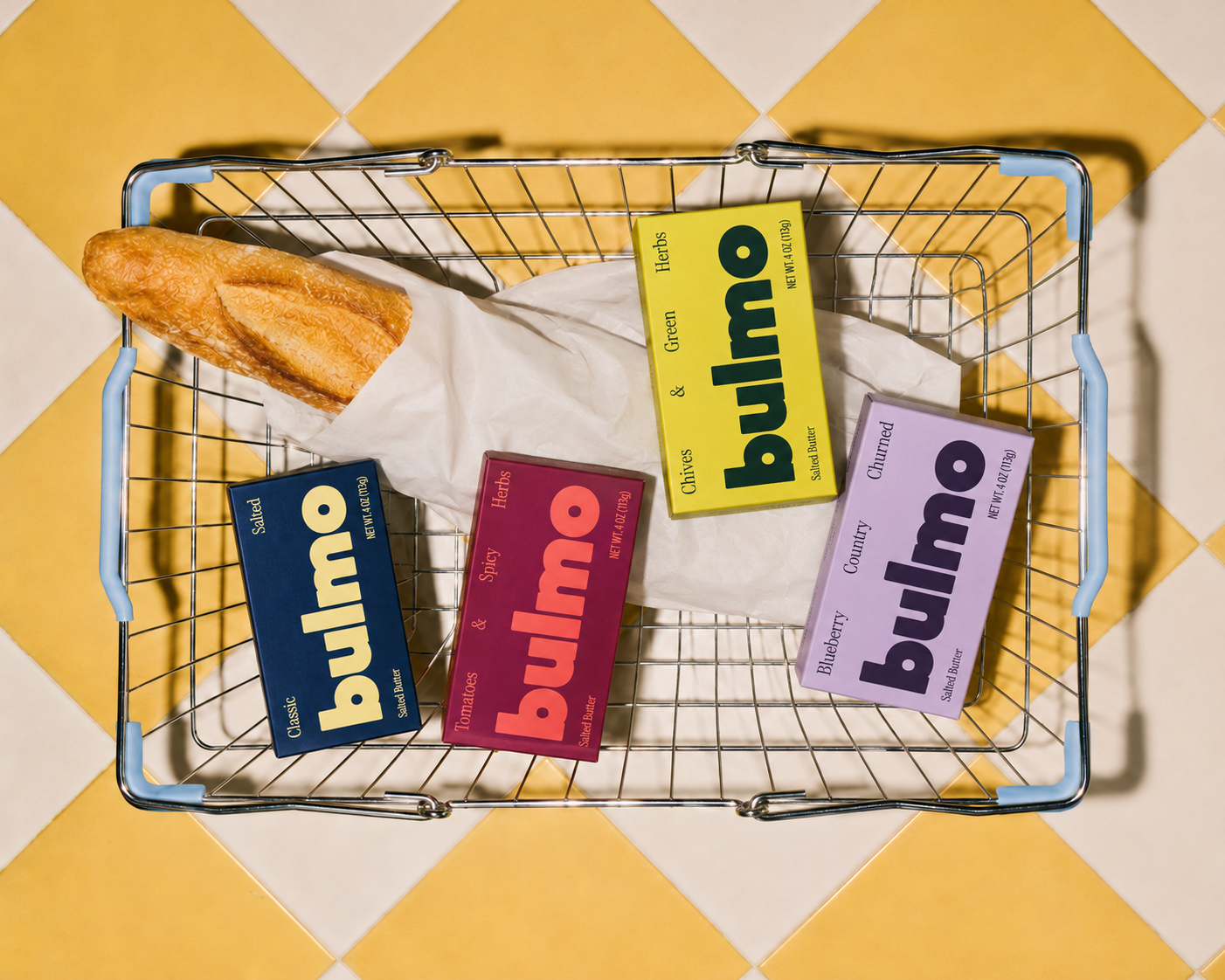
Bulmo is a four-flavour butter brand built to skip the language every other butter brand reaches for: artisanal, elevated, curated. The concept called for something more direct, a brand with enough personality to stand out in a category that mostly looks the same shelf to shelf.
I led every part of it myself: naming, brand identity, packaging design, and art direction, including the photography style and voice guidelines that carried the concept from shelf to social.
[01] The Challenge
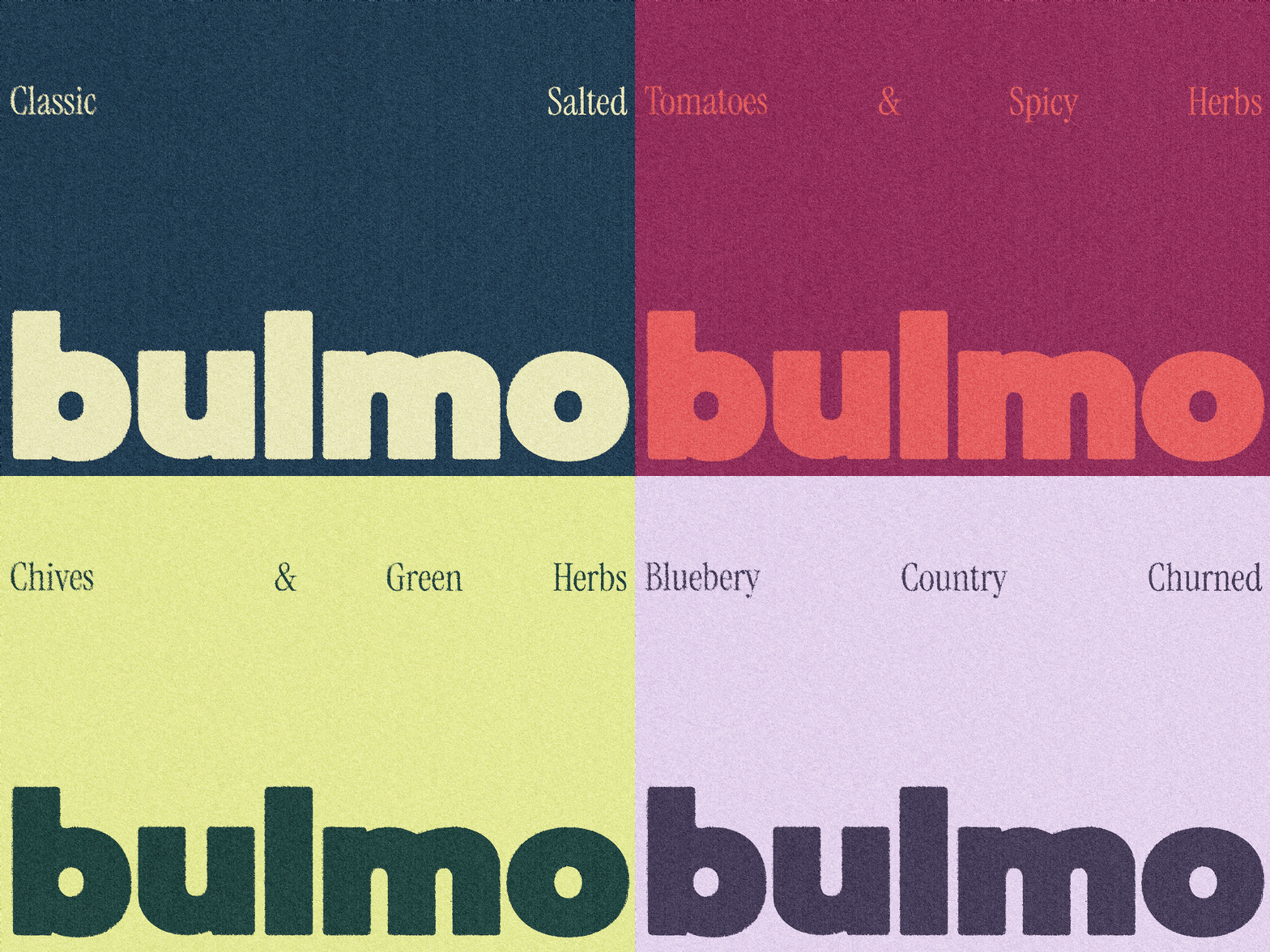
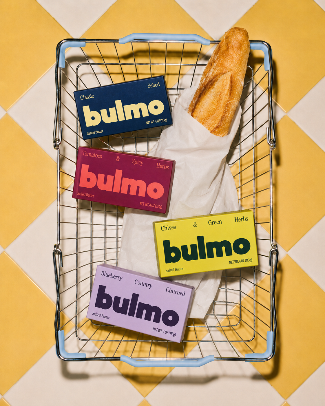
Butter packaging tends to blur together, soft serif type, muted tones, the same handful of words repeated across every brand in the aisle. Bulmo needed to break from that without losing trust, striking, but not so far off from what a butter brand is expected to look like that it reads as gimmicky. Four flavours also had to feel distinct enough to grab attention individually, while still reading clearly as one cohesive family on shelf.
[02] The Response
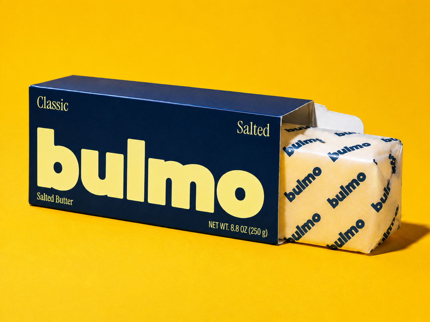
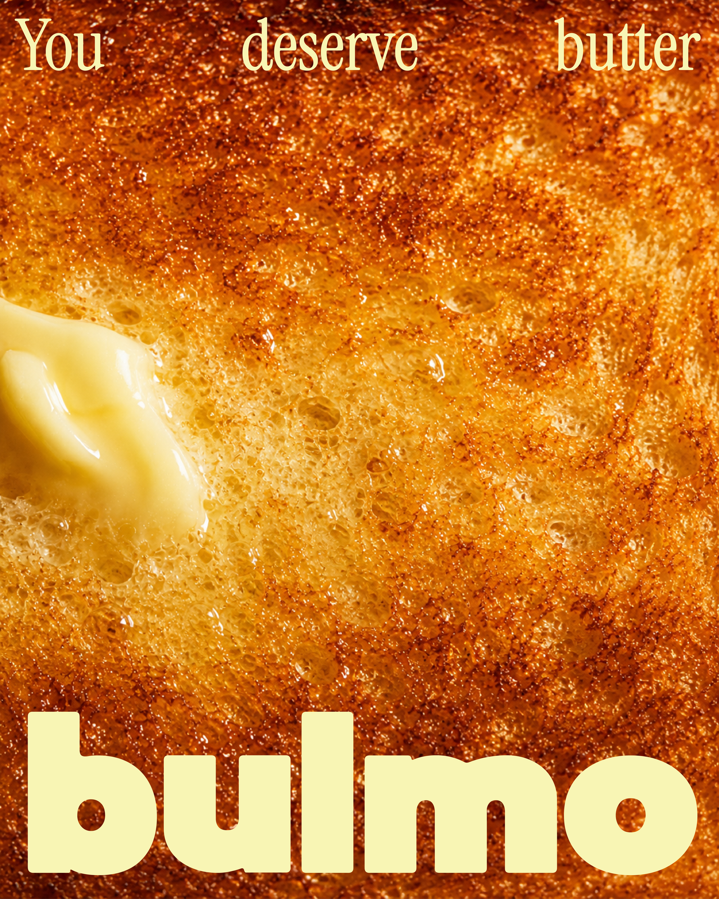
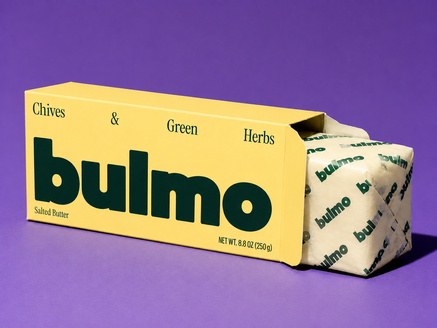
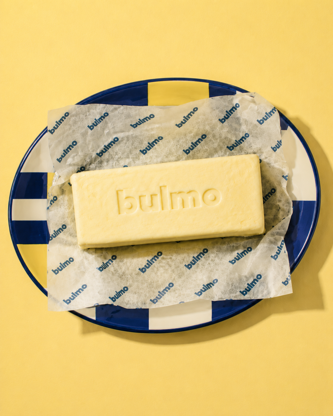
The name stayed short and blunt, paired with an oversized, chunky wordmark built to read from across a shelf. Each flavour got its own bold colourway rather than a safe, unified palette, so the range reads as personality, not a line extension nobody can tell apart. A brand voice doc set clear rules (say this, never say that, sound like a friend who cooks and won't gatekeep the recipe) so packaging, photography, and copy stayed consistent. Photography leans into mid-melt, tactile shots over sterile product grids, and the system extends past the shelf through farmers market packaging, recipe cards, and merch.