Veroa Fintech Branding

Project Type
Brand Identity
Digital Product
Fintech
Services
Art Direction
Brand Identity
Campaign Design
Digital Design
Project Overview
A fintech brand built to make money feel less like banking.
VEROA is a fintech platform designed around clarity, ease and modern technology. The identity combines soft lilac gradients, bold black typography and a flexible radial symbol to create a visual language that feels both current and lasting.
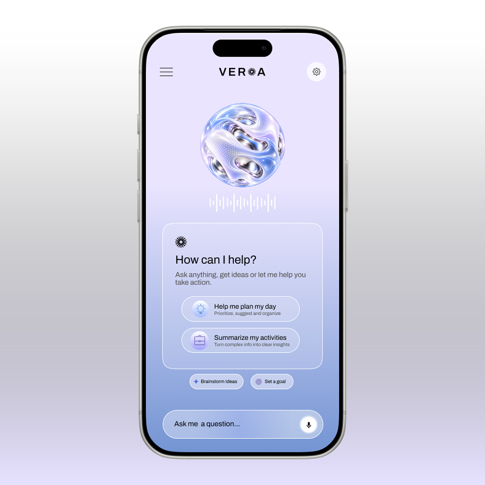
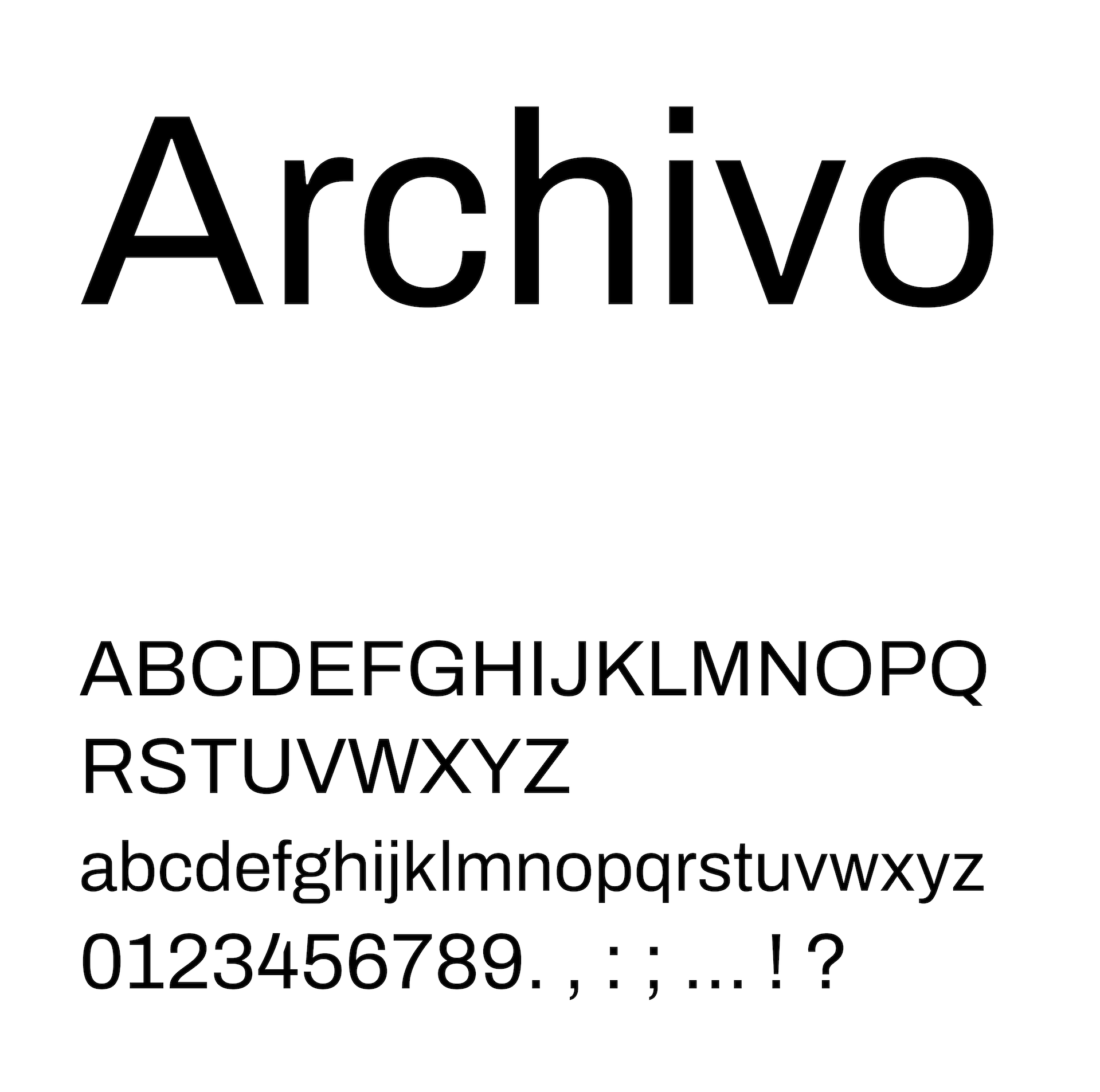
The concept was built around contrast. Soft backgrounds and luminous digital elements create a sense of calm, while strong grotesque typography gives the brand confidence and structure. The system extends across the app, cards, campaigns, environmental graphics and branded applications.
[01] The Challenge
Financial products often carry a lot of visual and mental weight. Interfaces become crowded, processes feel technical, and fintech brands frequently rely on familiar cues like dark palettes, green accents and traditional financial imagery.
The goal was to create something that still felt credible and technology-driven, but lighter and easier to interact with. VEROA needed to communicate advanced technology without making the experience feel complicated, cold or intimidating.
[02] The Response
I built the identity around contrast between softness and structure. Lilac gradients and spacious layouts create a calm foundation, while bold black grotesque typography adds clarity, confidence and a more timeless quality.
The VEROA wordmark replaces the O with a radial symbol developed in Illustrator. Its simple geometric construction makes it recognizable at small sizes while allowing it to expand into patterns, icons and supporting graphics throughout the system.
For the digital experience, glass-like surfaces, soft gradients and dimensional elements reinforce the idea of seamless technology. The interface was designed to remove visual clutter and make interactions feel smooth and intuitive, reflecting the product itself: fewer steps, less stress and a clearer way to manage business finances.