
Mimochi Goods
Project Type
Brand Identity
Web Design
Services
Brand Identity, Icon Design, Web Design, Art Direction
Project Overview
A sourcing company built to look like a tech brand.
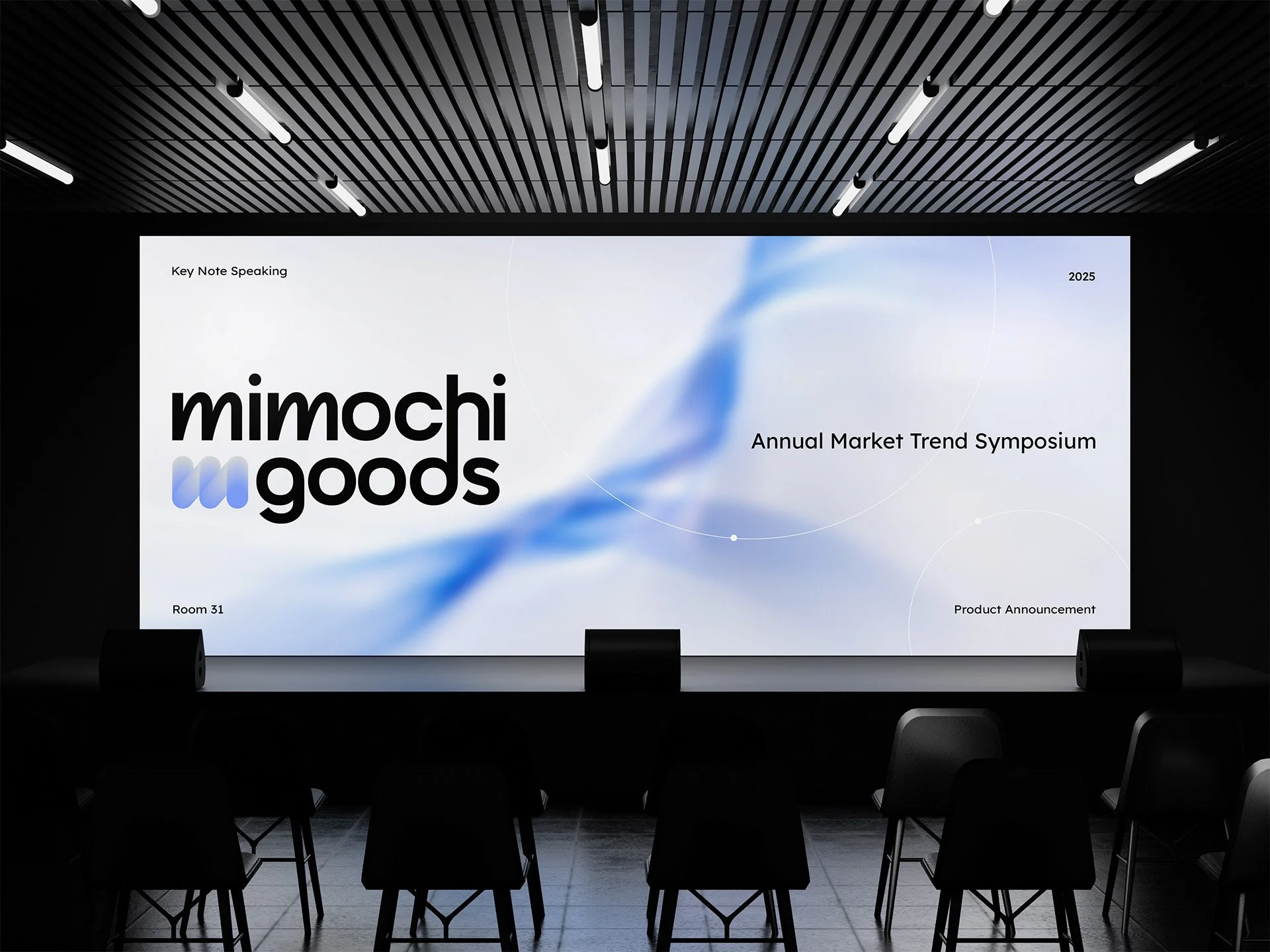
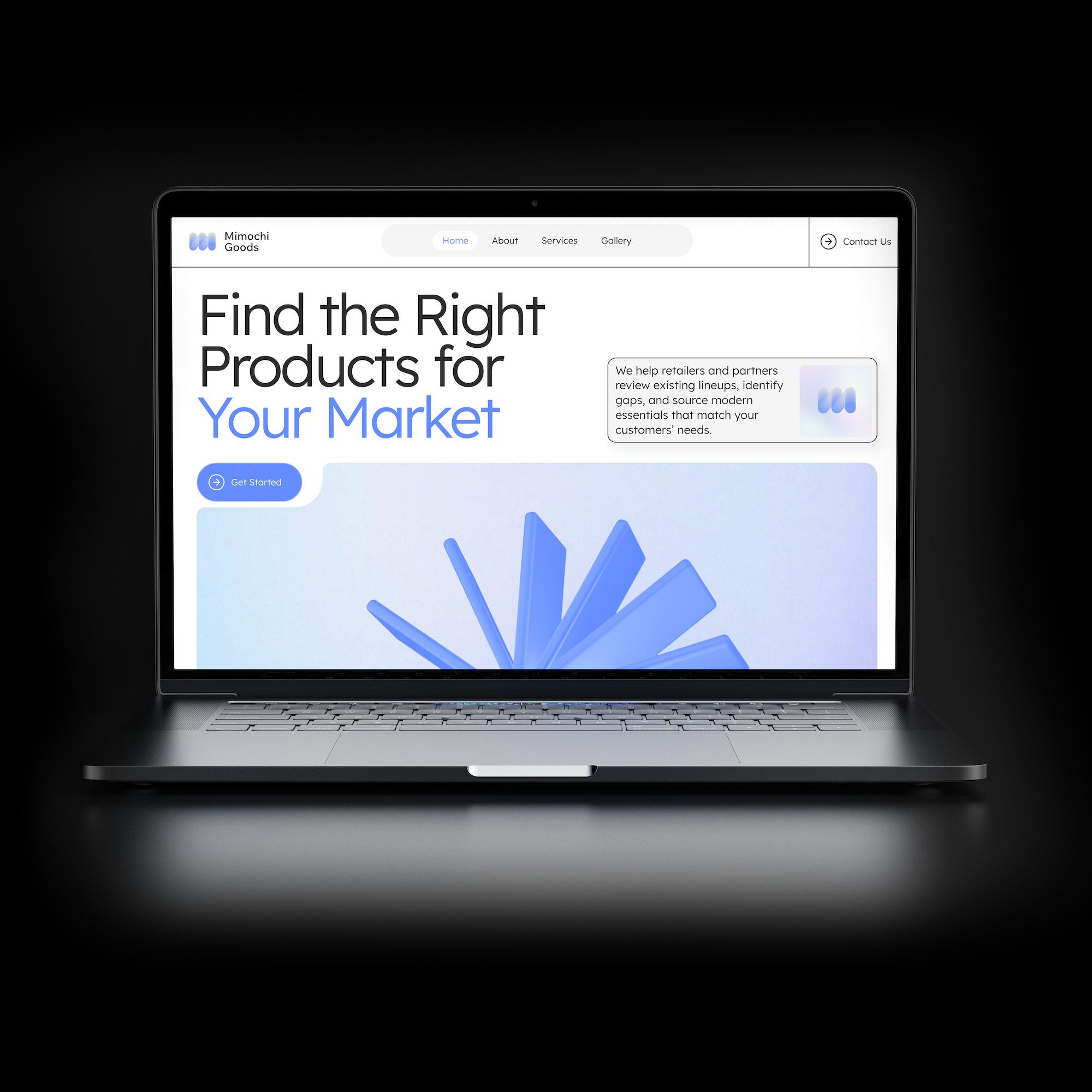
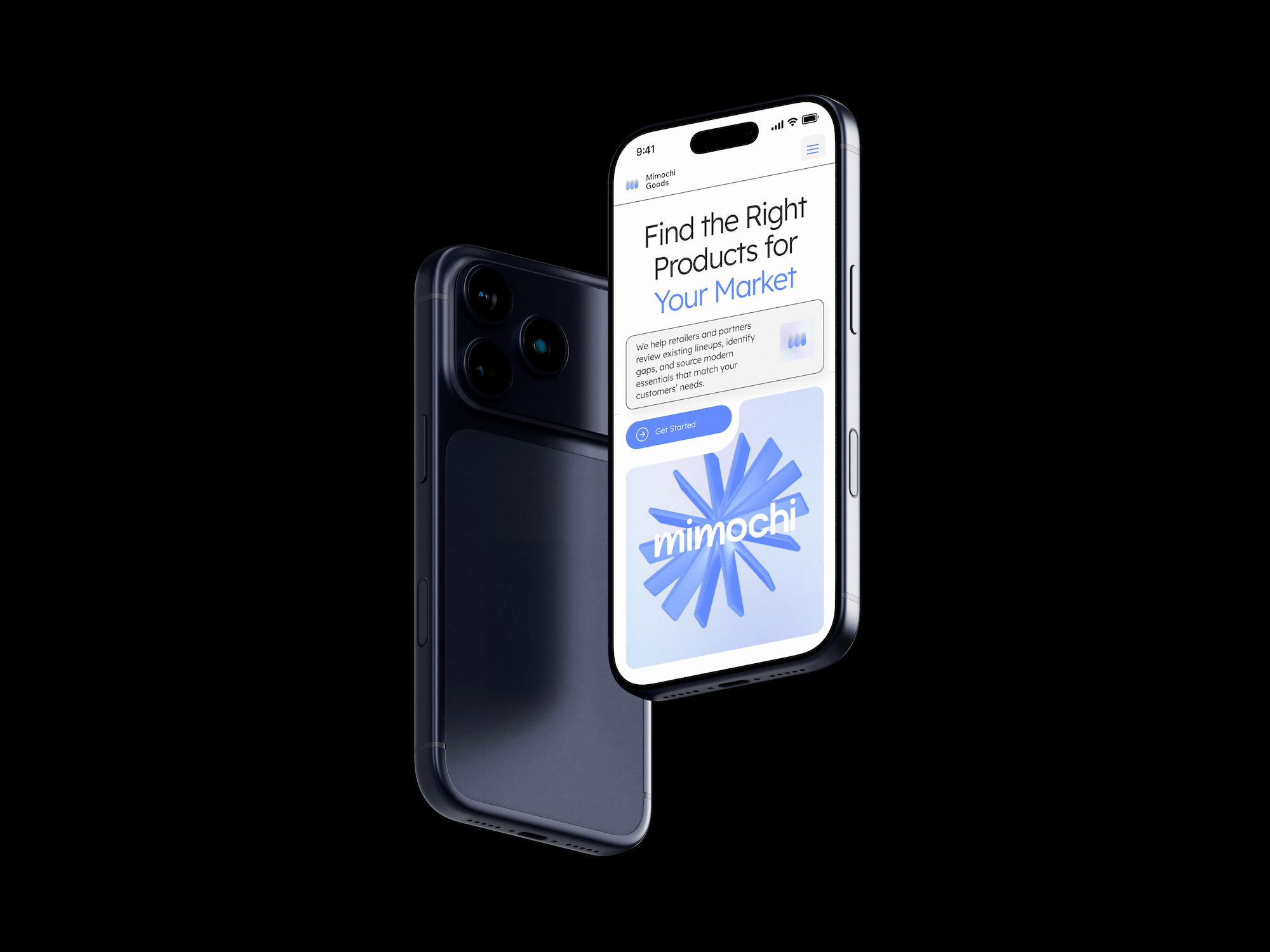
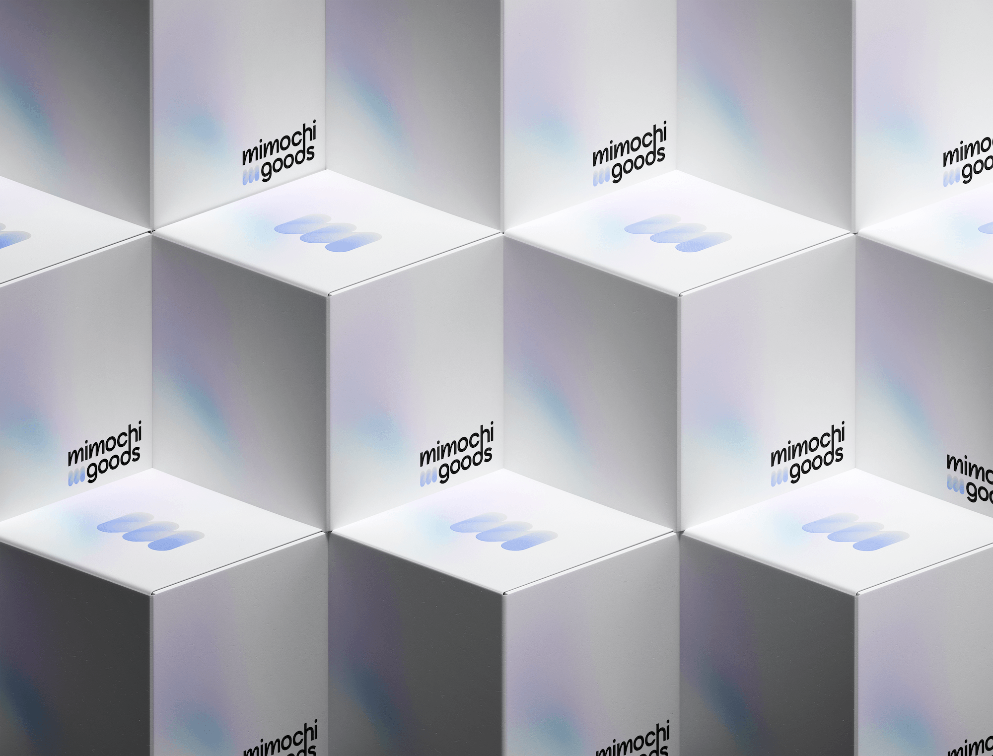
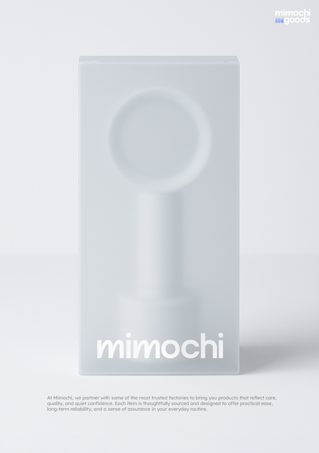
Mimochi Goods needed a site that felt like a tech brand, clean and considered, close to Apple's product pages, even though the business itself is B2B sourcing, a category that almost never gets branding this polished.
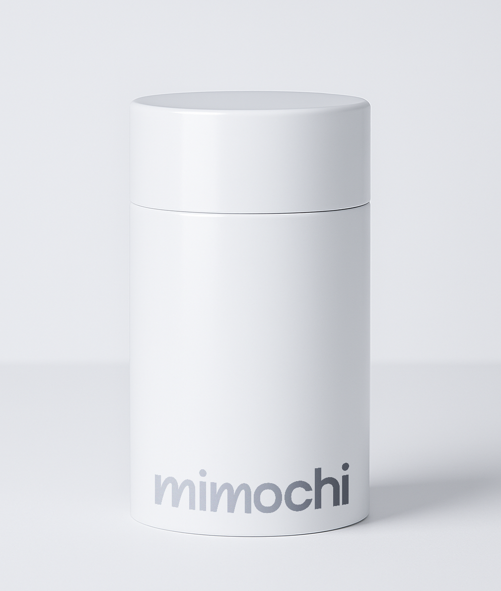
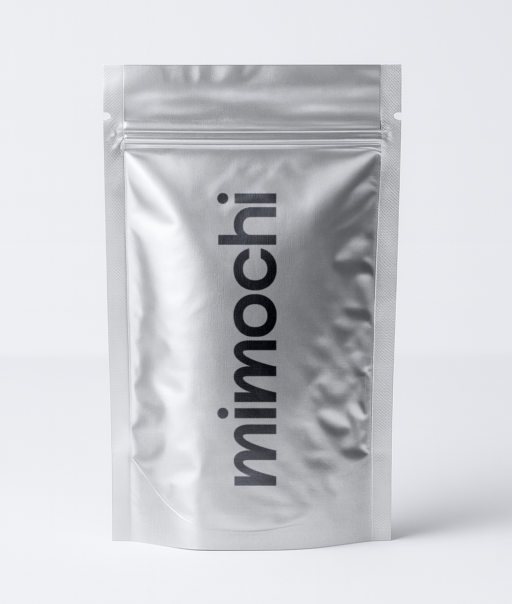
I built the identity from the ground up, primary and secondary logos, an icon system, and a full brand palette, then built out the site itself on a Wix template that came with only the homepage prebuilt.
See it live here
[01] The Challenge
Sourcing companies don't typically get design attention like this, so there was no category precedent to lean on, the brand had to earn its "clean tech" feel from nothing. The site's starting template only had one page built, leaving About, Services, and the gallery structure entirely undefined. On top of that, the client sold a wide range of unrelated products, tools, electronics, home goods, that needed to look like they came from one cohesive brand rather than a random catalogue.
[02] The Response
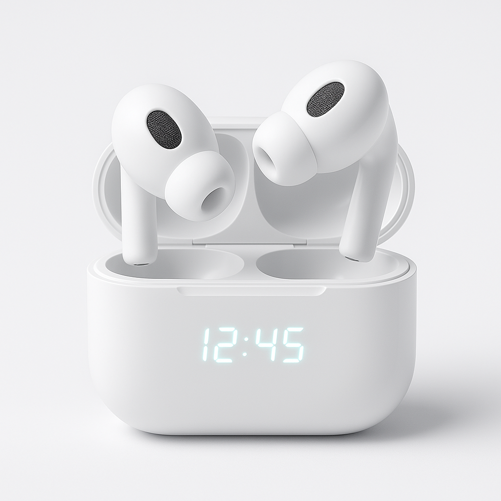
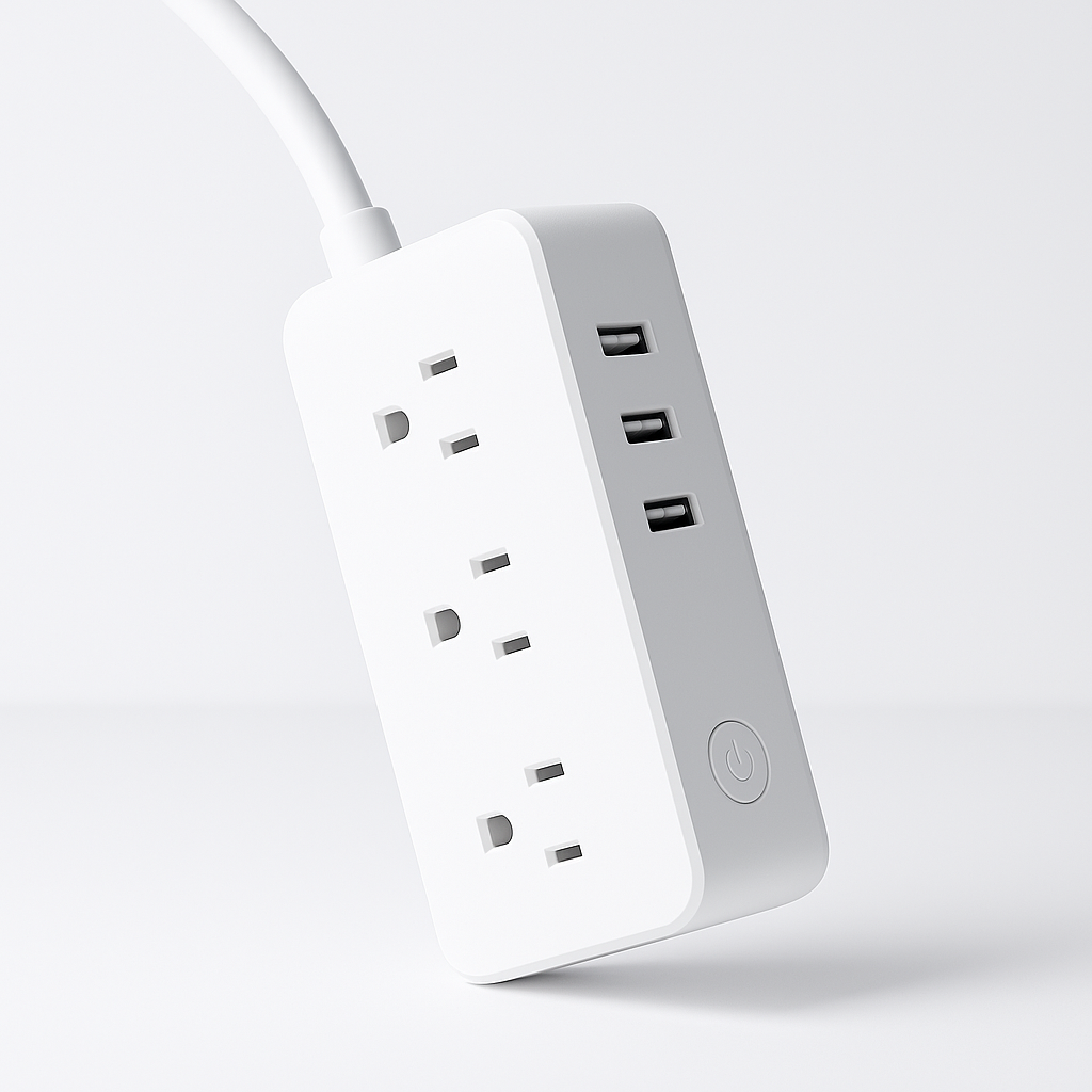
I designed and built the About and Services pages from scratch, pulling select sections from the homepage where they fit to keep the site consistent throughout. The gallery pages were built entirely new, including a fanned scroll effect across product images and a cursor-follow interaction, giving the site the tactile, tech-forward feel the brief called for. Every product shot across every gallery was art directed to match, soft pastels, minimal staging, consistent lighting, so a utility knife and a pair of earbuds could sit in the same brand world without friction.


Video walkthrough of the website