
Self+ Healthcare Agency
Project Type
Brand Identity
Digital Marketing
Services
Naming Direction
Brand Identity
Art Direction
Digital Design
Project Overview
Energy that still reads as trustworthy.
Self+ is a marketing agency built by NU Media Edge to serve healthcare professionals, clinics, pharmacies, and providers who need marketing that doesn't look or sound like typical healthcare marketing.
Brought on as lead designer ahead of launch, I built the identity from just a name, with full creative trust over the direction, then refined it in close collaboration with NU Media Edge's art director to align with their long-term plans.
[01] The Challenge
Healthcare marketing tends to split into two lanes: sterile and clinical, or generic and forgettable. Self+ needed to sit outside both, energetic enough to stand out in a crowded agency space, credible enough that clinics and providers would trust it with their brand. With only a name to start from, every visual decision, the mark, the palette, the tone, had to build that balance from scratch, and still hold up as the agency scaled past launch.
[02] The Response
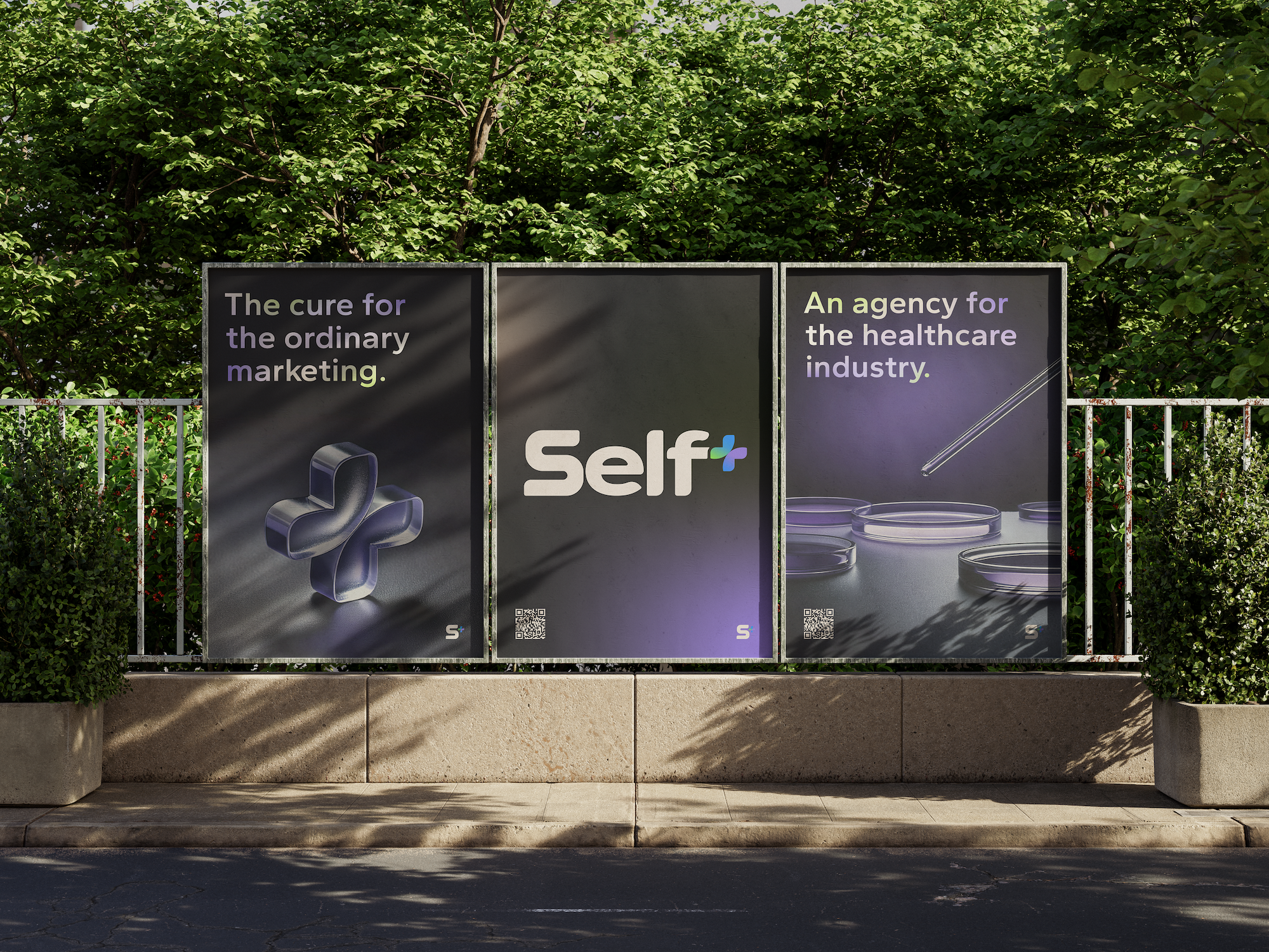
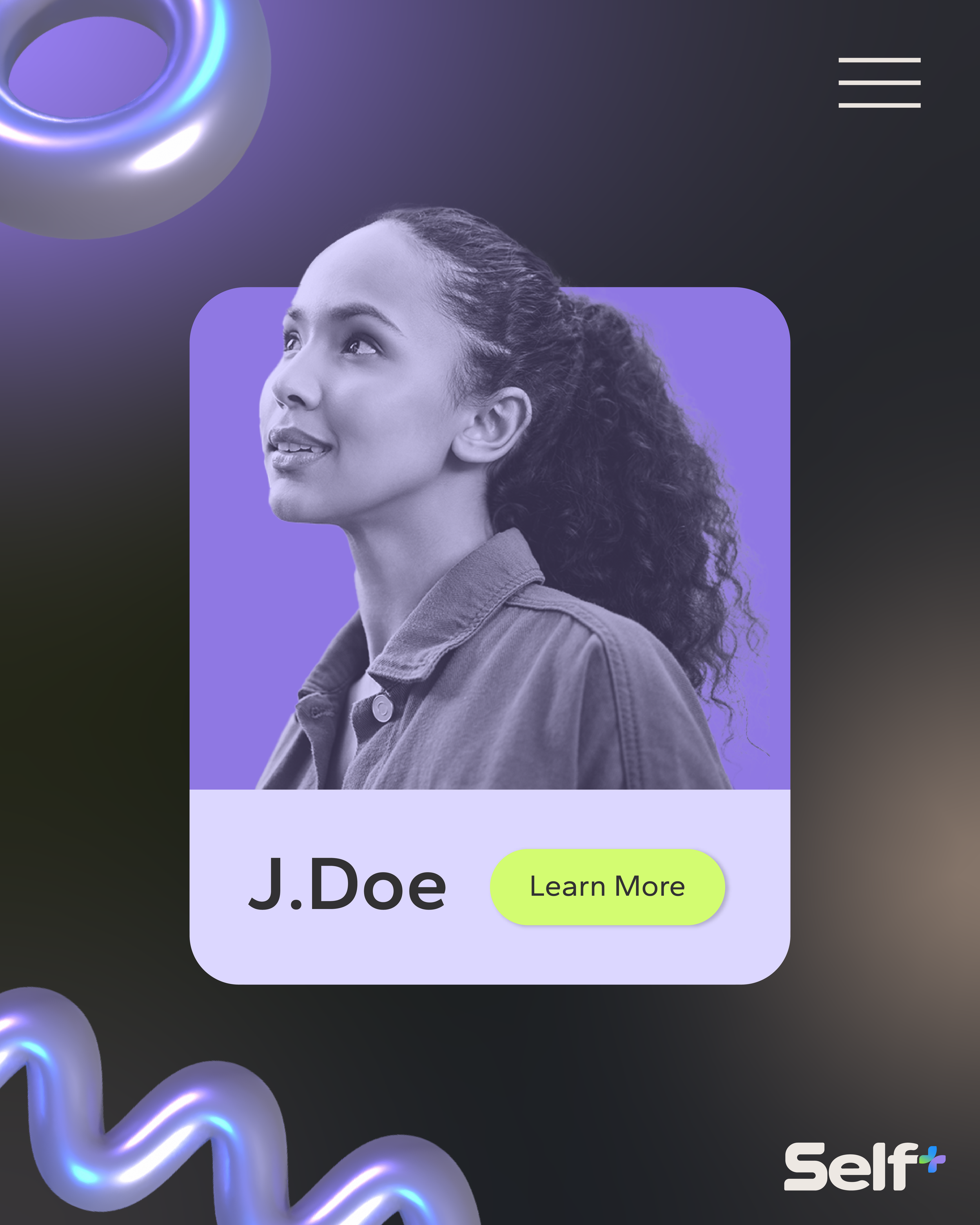
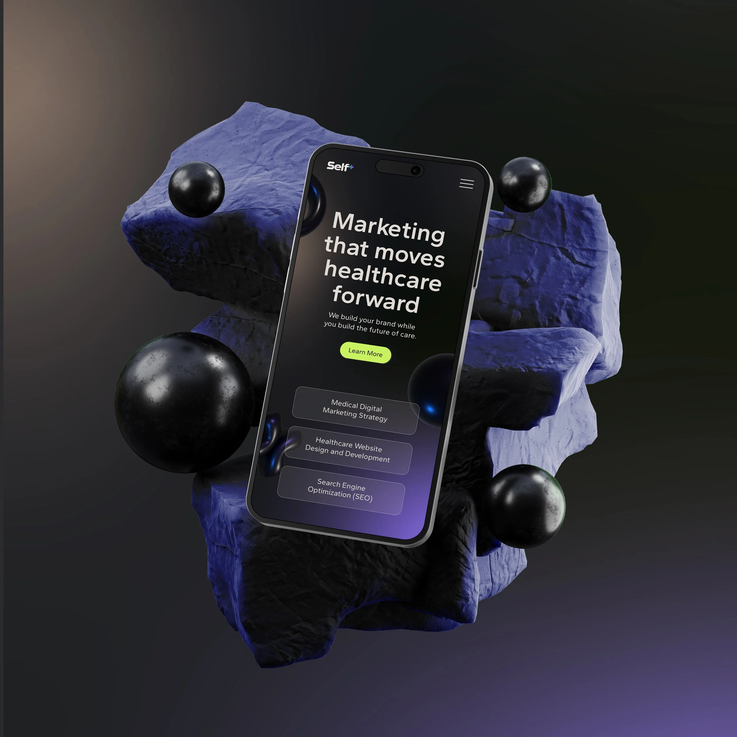
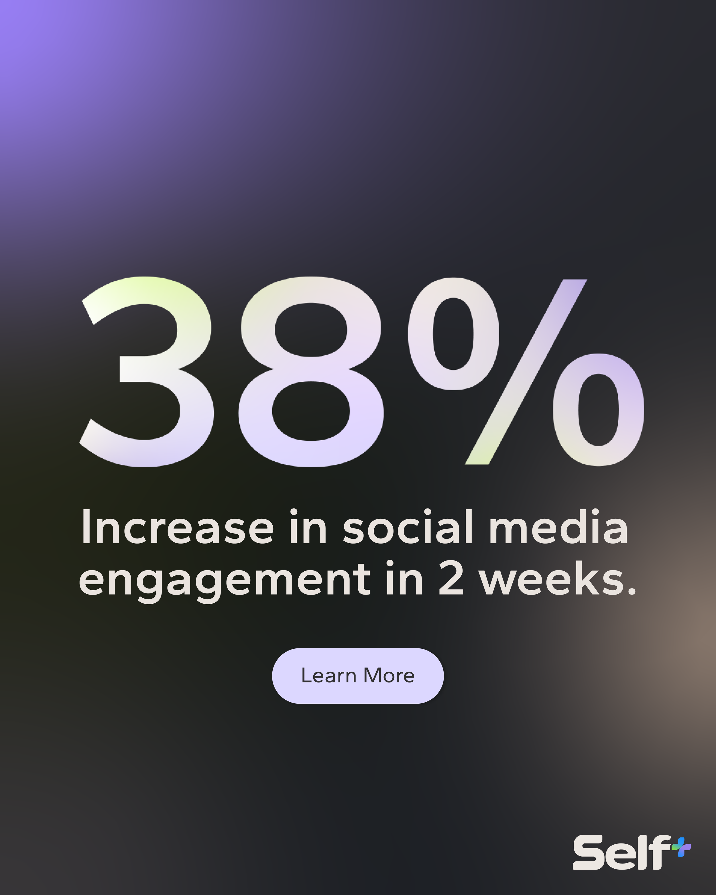
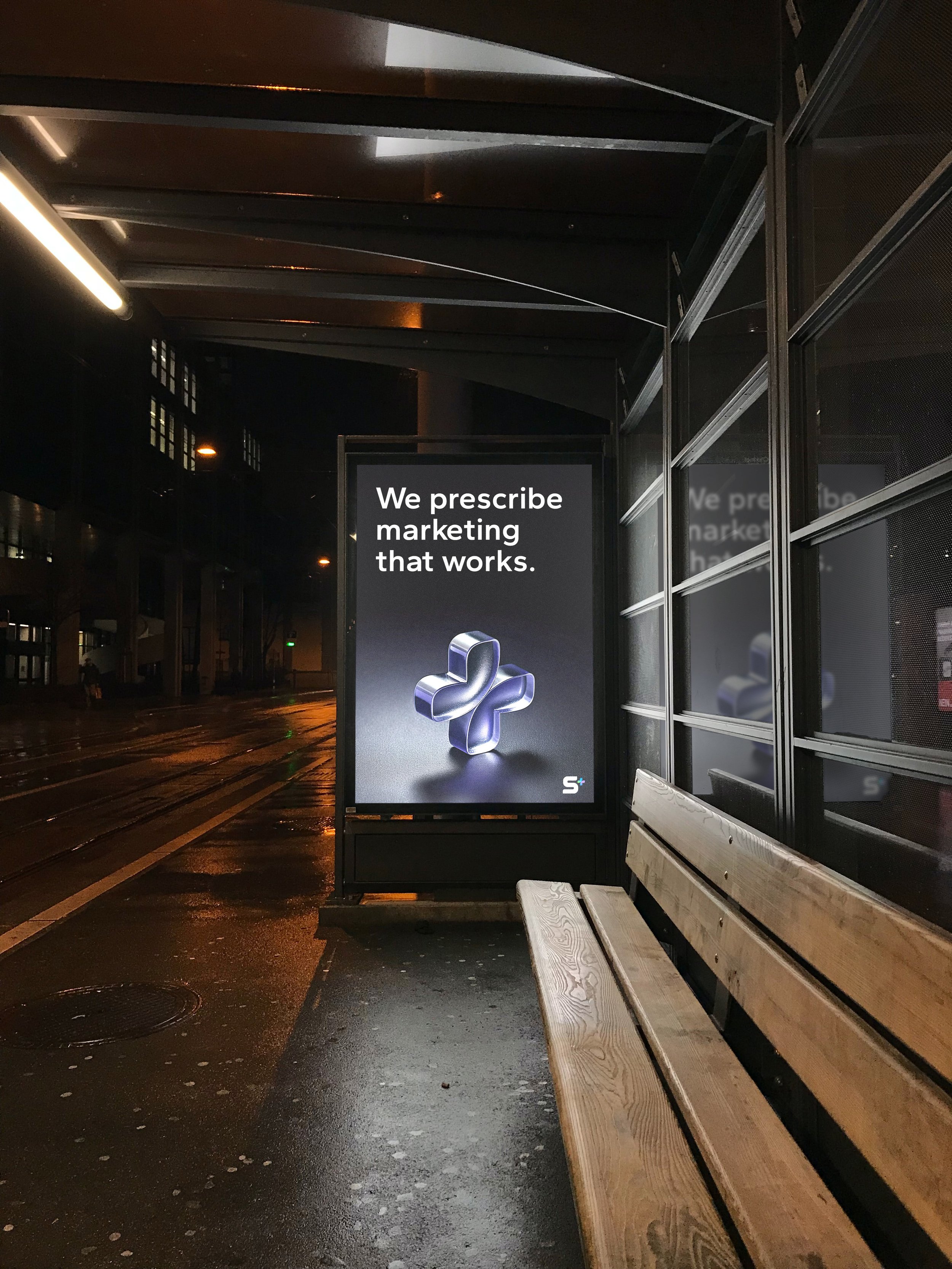
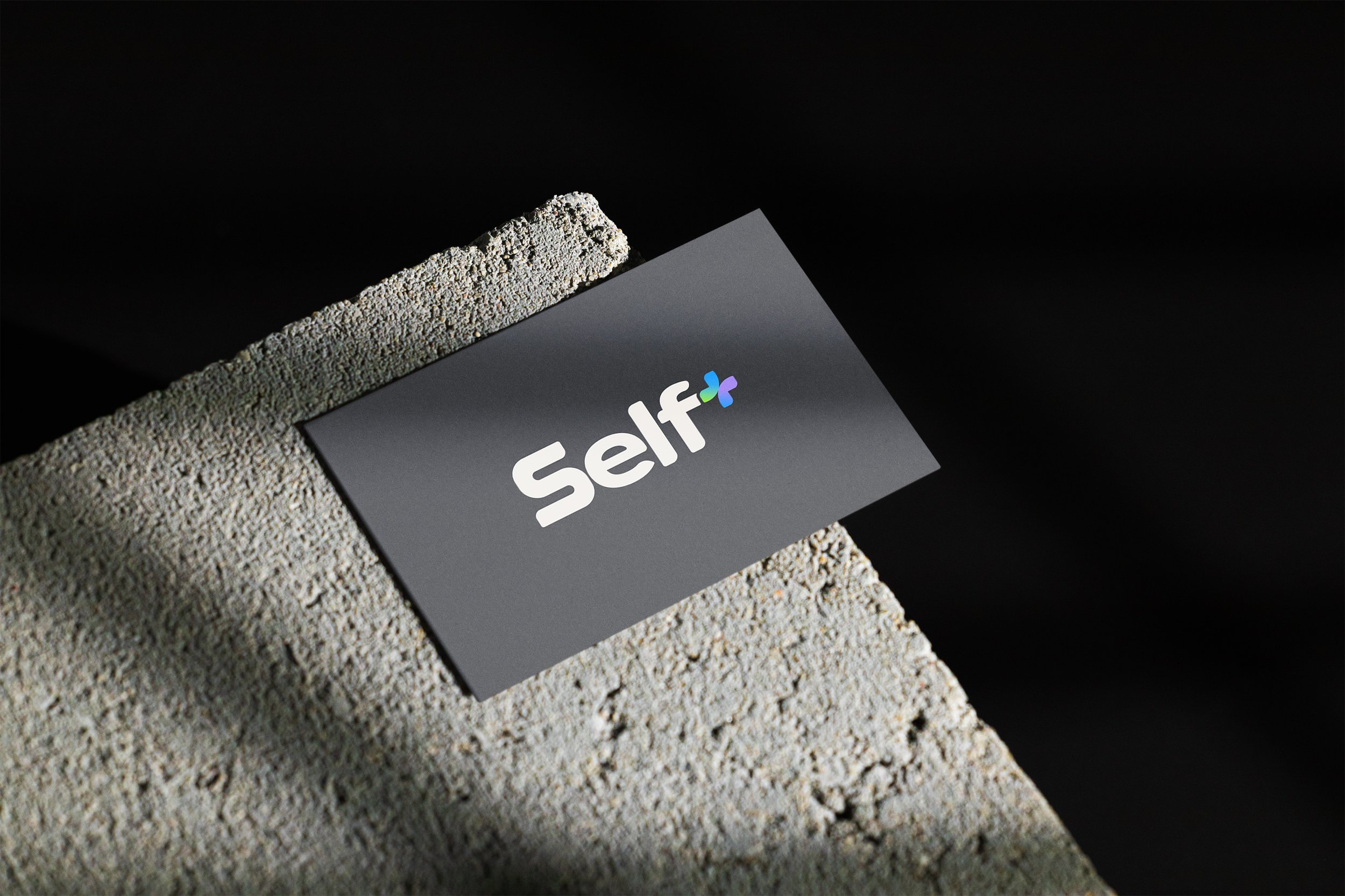
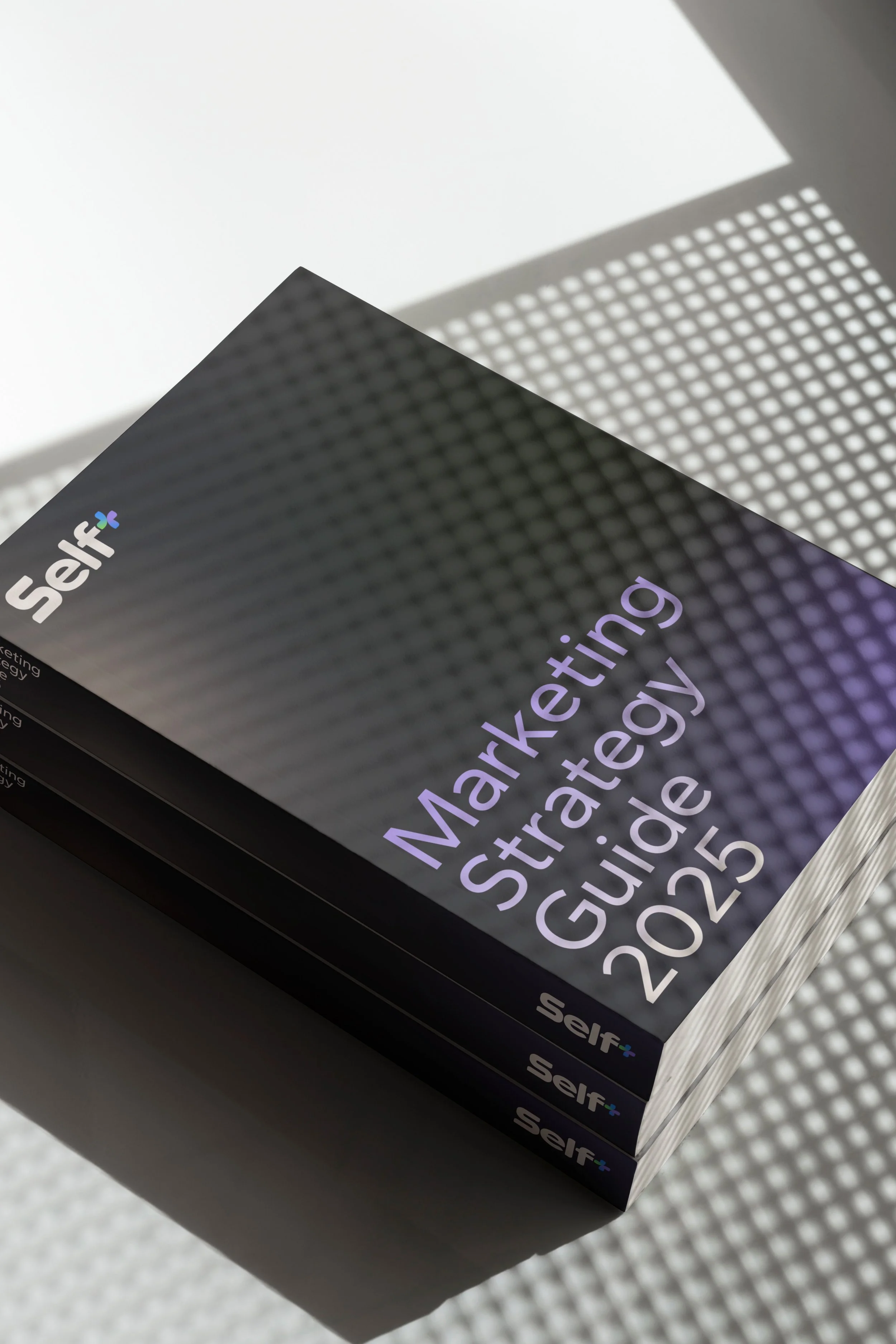
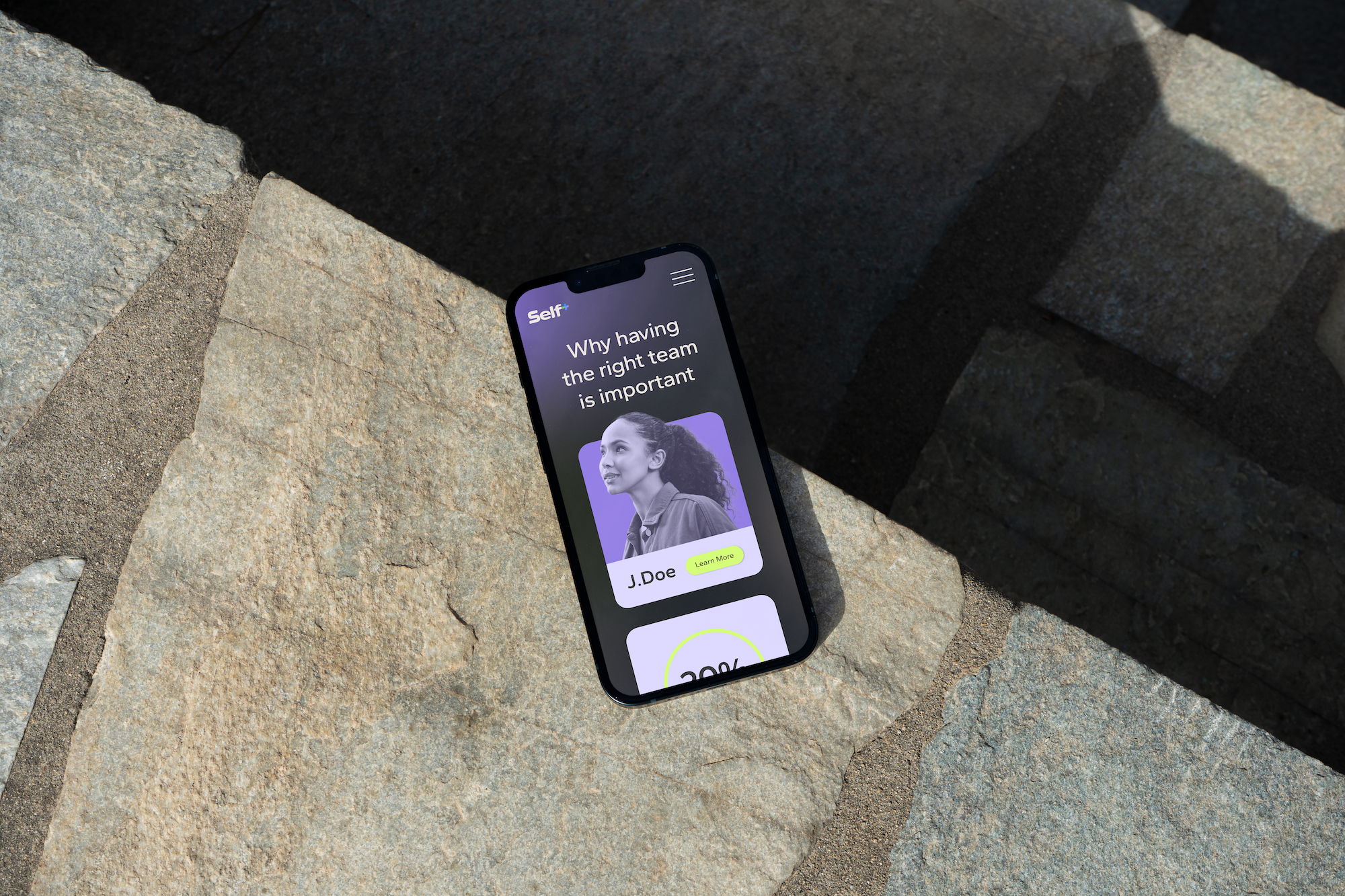
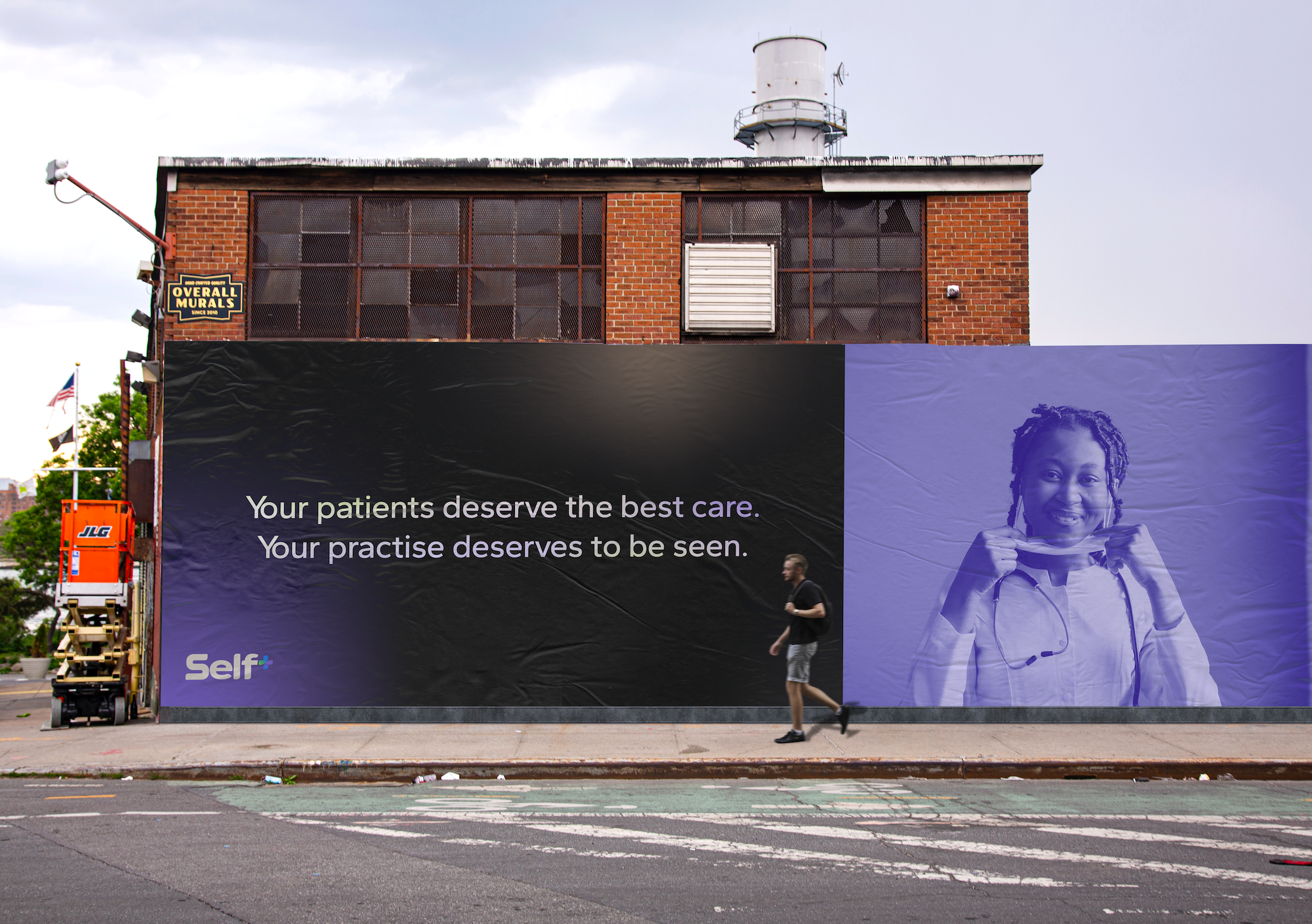
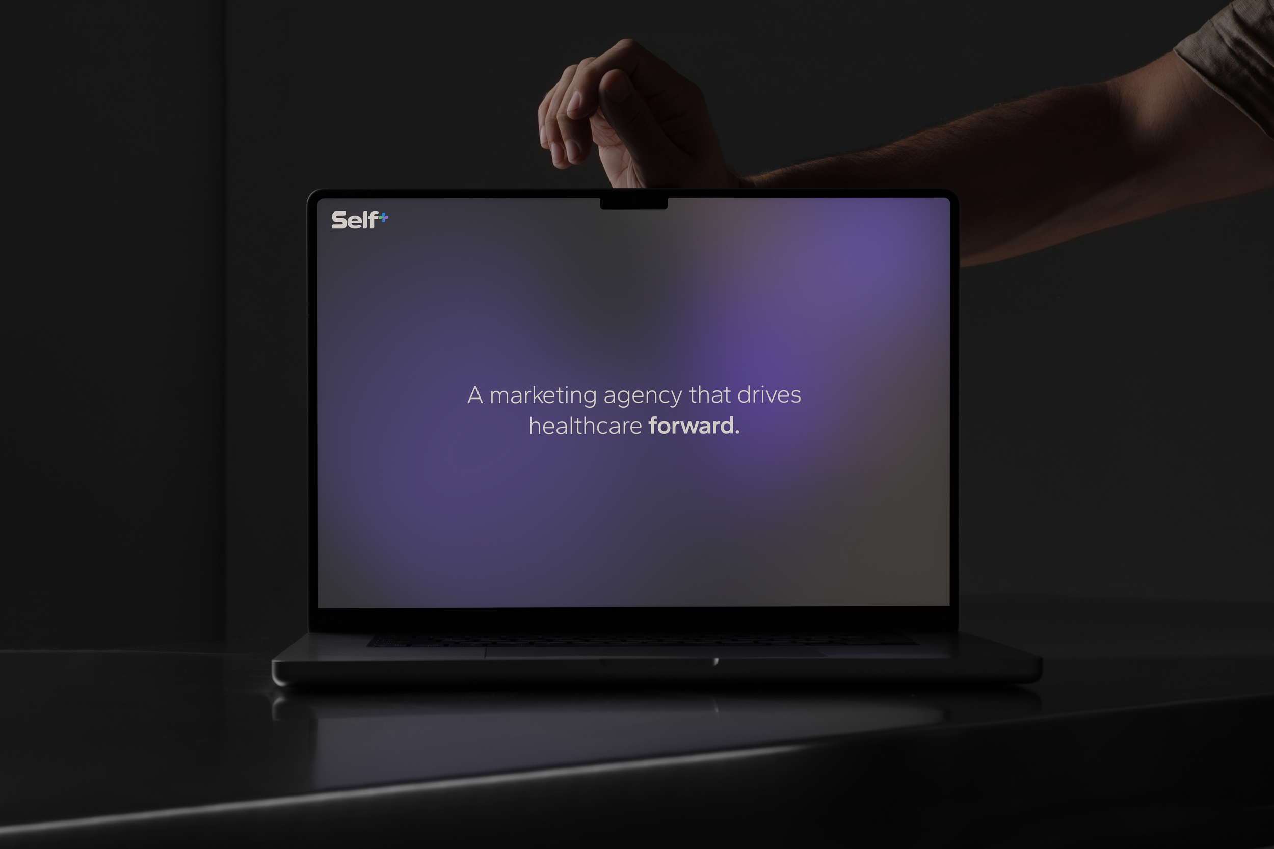
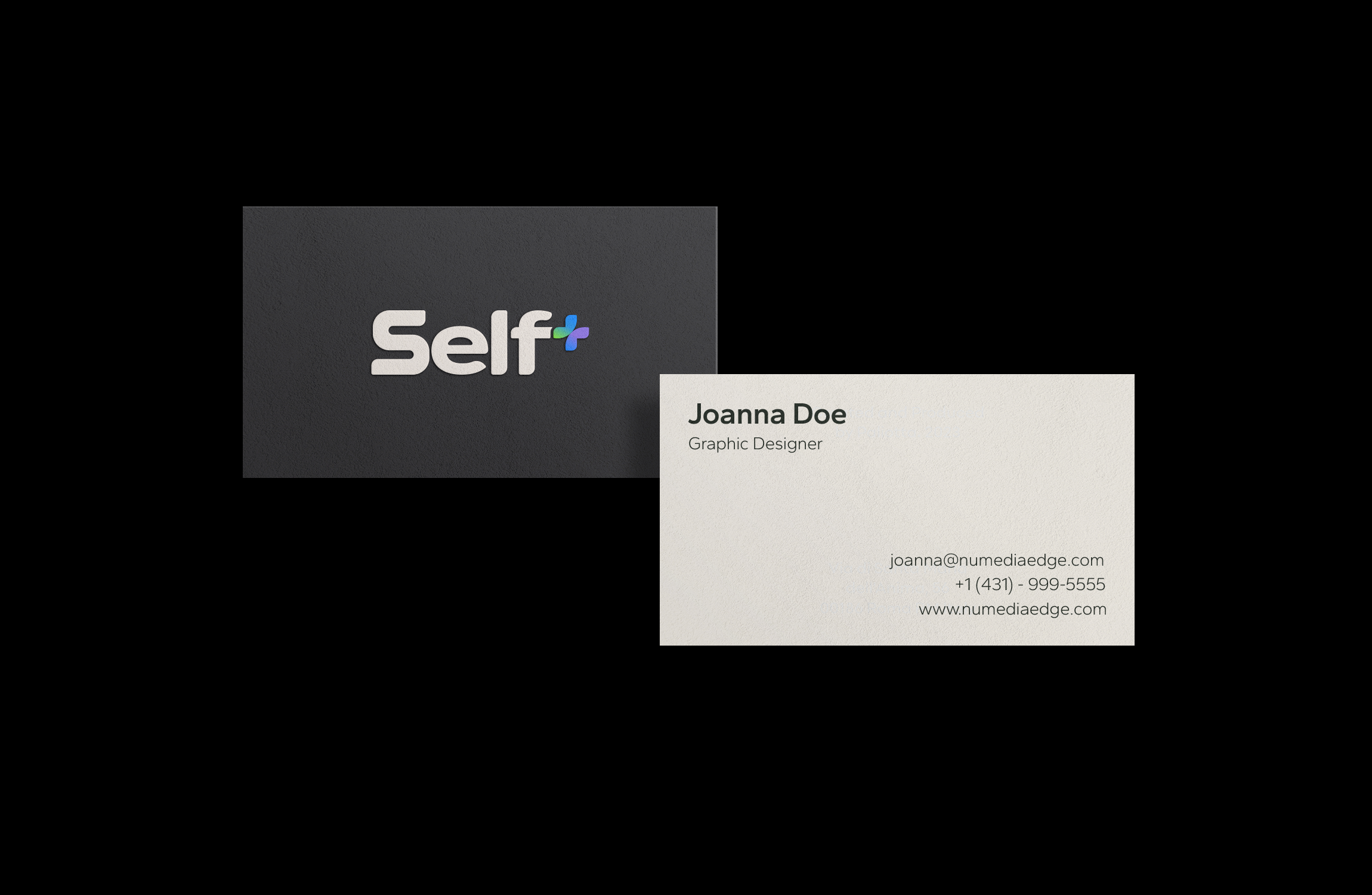
I built a custom logotype paired with a vibrant gradient symbol, a mark carrying both energy and precision rather than settling for one. Dark, elegant tones paired with neon gradient accents gave the system its edge, while typography stayed modern but approachable, never sterile. The identity extended into 3D brand visuals and outdoor executions, built to hold attention in real environments, not just on a screen. Every decision got checked against the same standard: growth-focused enough to sell, grounded enough to feel like healthcare.
Brand Guidelines for Self+
For portfolio display purposes only | All rights belong to NU Media Edge